Published
A design token is a named value stored in a file — a colour, a spacing step, a duration — written once with a type attached, and compiled by a build step into CSS custom properties, Swift and Android resources. It is the unit that lets one edit change every screen that references it.
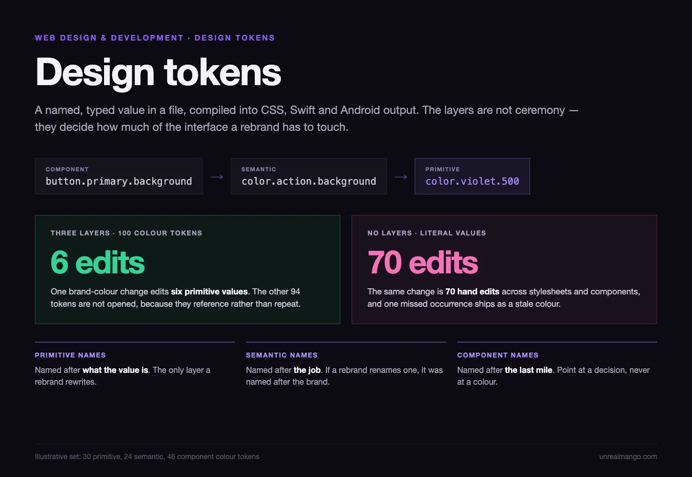
Here is the part that decides how you should structure them. In a three-layer token set of 100 colour tokens, a full brand-colour change edits six values. The other 94 tokens are not touched, not renamed, and not reviewed, because they point at the six rather than repeating them. Without the layers, the same change is 70 hand edits across stylesheets and component files, and one missed occurrence ships as a stale colour.
Where the specifics here come from. Format details are from the Design Tokens Format Module, version 2025.10, published by the Design Tokens Community Group as a Draft Community Group Report dated 30 July 2026 — a draft, not a W3C standard. API behaviour is from Figma’s REST API documentation for the variables endpoints, and build behaviour from the Style Dictionary v5 documentation. The 100-token example is illustrative arithmetic, not a measurement.
A design token is a typed name-value pair in a source file that tools compile into platform code.
- It is not a CSS variable. A custom property is one compiled output of a token. The same token also produces a Swift constant and an Android resource, from one source and one edit.
- It is not a Figma style or a Figma variable. Those live inside one design tool’s file. A token file lives in your repository and outlives the tool.
- It is not a colour palette. A palette is the raw values. Tokens are the names attached to values, and the names are the part the code depends on.
What sits inside one design token file
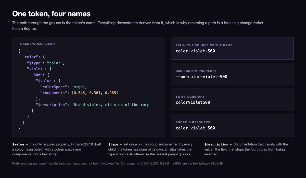
A token file is JSON. Nesting creates groups, and the path through those groups becomes the token’s name in every output the build produces.
{
  "color": {
    "$type": "color",
    "violet": {
      "500": {
        "$value": { "colorSpace": "srgb", "components": [0.545, 0.361, 0.965] },
        "$description": "Brand violet, mid step of the ramp"
      }
    }
  },
  "space": {
    "md": { "$type": "dimension", "$value": { "value": 1, "unit": "rem" } }
  }
}
Four things are doing work there, and only one of them is the colour.
- The path is the name.
color.violet.500is what the build flattens into--color-violet-500,colorViolet500orcolor_violet_500depending on the platform, before any prefix the build configuration adds. Rename the path later and you have made a breaking change for every consumer, which is why naming gets a section of its own below. $valueis the only required property. Everything else is optional, including the type.$typecan be omitted and inferred. If a token declares no type of its own and its value is a reference, it takes the resolved type of the token it points at; otherwise the type is inherited from the closest parent group that declares one. If neither resolves, the token is invalid. Setting$typeonce on thecolorgroup, as above, types every colour beneath it.$descriptionis documentation that travels with the value. It is the field that stops the second designer from inventing a fourth grey.
Two more properties exist and are worth knowing before you inherit someone else’s file: $extensions, where vendors park their own metadata under reverse-domain keys, and $deprecated, which marks a token as on its way out without deleting it and breaking a build overnight.
Then there is the alias. A token’s value can be a reference to another token, written as a period-separated path in curly brackets — {color.violet.500}. Tools must resolve the reference to get the value, and circular references are prohibited. The draft also defines a pointer form using $ref for addressing a single property inside a token, but the curly-bracket path is what you will meet in real files. That one feature is what makes the layers below possible.
Primitive, semantic, component: which layer a rebrand actually edits
Three layers, each one referencing the layer below it rather than repeating its values.
{
  "color": {
    "$type": "color",
    "action": { "background": { "$value": "{color.violet.500}" } }
  },
  "button": {
    "primary": { "background": { "$value": "{color.action.background}" } }
  }
}
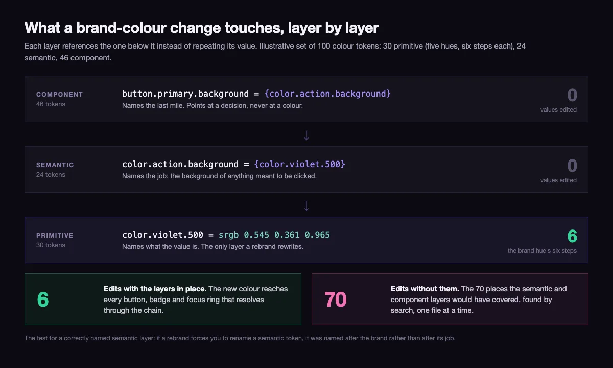
Primitive tokens name raw values: color.violet.500, space.md. They describe what the value is and nothing about where it is used. Semantic tokens name decisions: color.action.background means the background of anything the user is meant to click, and it points at a primitive. Component tokens name the last mile: button.primary.background points at the semantic token, not at the violet.
The chain looks like indirection for its own sake until the brand changes. Then it is the whole point.
| Layer | Colour tokens in the set | Values a brand-colour change edits |
|---|---|---|
| Primitive | 30 — five hues, six steps each | 6 — the six steps of the brand hue |
| Semantic | 24 | 0 |
| Component | 46 | 0 |
| Total | 100 | 6 |
Six edits, and the new colour reaches every button, badge and focus ring that resolves through the chain. Nothing above the primitive layer is opened, which also means nothing above it needs re-reviewing.
Run the same change through a set with no layers — component values holding literal colours — and the edit is the 70 places the semantic and component layers would have covered, found by search, one file at a time. The failure mode is not the effort. It is that a search for one hex value cannot find the same colour written as rgb() in a shadow three components away, so a rebrand of this shape reliably leaves two or three surfaces on the old brand, and they surface months later in a screenshot from a client.
This is also the test for whether your semantic layer is named correctly. If a rebrand forces you to rename a semantic token, it was named after the brand rather than after its job. color.brand.purple is a primitive wearing a semantic hat, and it dies the day purple does. color.action.background survives, because what it describes did not change — only the value underneath it did.
Everything above concerns the mechanics of one file. Whether a token set is worth running at all is a different question, and it belongs to the wider design system it sits inside — the layers above tokens, who maintains them, and what that costs every quarter. The brand rules that a token set encodes usually start life in a document, and what belongs in that document is worked through in our piece on brand guidelines examples.
Why the design token spec is still a draft in 2026
The format everyone means when they say design tokens is the Design Tokens Format Module, maintained by the Design Tokens Community Group. Its current published shape is version 2025.10, a Draft Community Group Report dated 30 July 2026. It is explicitly not a W3C standard, and the difference is not academic.
The clearest example is colour. Earlier drafts wrote a colour token’s value as a plain hex string. The current draft writes it as an object with a colour space and an array of components, with hex kept only as an optional fallback:
{ "$value": { "colorSpace": "srgb", "components": [0.545, 0.361, 0.965], "hex": "#8b5cf6" } }Both files are described by their authors as design tokens. A parser written against one shape does not read the other. So the practical questions when a token file arrives from a plugin, an agency or a public repository are: which draft was it written against, and does the tool that consumes it agree.
That disagreement is visible in the tooling. Style Dictionary treats the format as something you opt into with an explicit usesDtcg flag rather than as the default; several design-tool plugins store tokens in their own dialect, most commonly with the $ prefixes dropped from value and type. None of that is broken software. It is the ordinary state of a format that has no ratified version to conform to.
Three rules keep it survivable. Pick one shape and write everything in it. Keep the conversion between dialects inside the build, where it is versioned, rather than in a person’s export habit. And never hand-edit a generated file — the next build overwrites it, and the fix disappears without a trace.
Two routes from the design tool to the token file
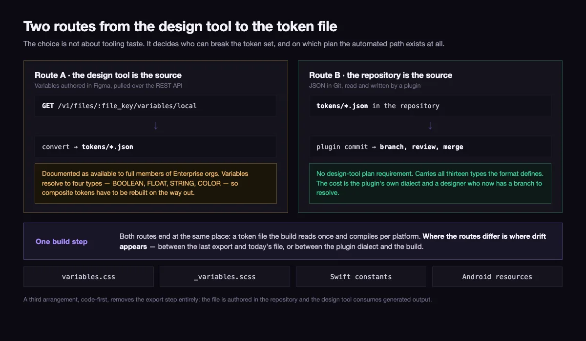
There are exactly two places the source of truth can live, and the choice determines who can break it.
Route A — the design tool is the source. Variables are authored in Figma and pulled out over its REST API: GET /v1/files/:file_key/variables/local for the working set, GET /v1/files/:file_key/variables/published for the published one, and POST /v1/files/:file_key/variables to write back. Two limits shape this route more than anything else. The documentation states that the variables API is available to full members of Enterprise orgs, so on any lower plan the automated pull simply is not available. And Figma variables resolve to four types — BOOLEAN, FLOAT, STRING and COLOR — which covers colours and numbers but has no native shape for the composite tokens the format defines, so shadows, borders and typography sets have to be reconstructed on the way out or maintained elsewhere. Modes come through on the local endpoint and are omitted from the published one, which is a detail worth checking before wiring a theme switch to the wrong call.
Route B — the repository is the source. Tokens live as JSON in Git, and a plugin such as Tokens Studio reads and writes that file, syncing to GitHub or GitLab. Designers still work visually; they commit like everyone else, and the review happens where reviews already happen. The cost is the plugin’s own dialect and the fact that a designer now has a branch.
A third arrangement is worth naming because it is the quietest one: code-first, where the file is authored in the repository and the design tool consumes generated output. It suits teams whose interface is mostly engineering-led, and it removes the export step entirely.
| Design tool as source | Repository as source | |
|---|---|---|
| Pull mechanism | REST API, Enterprise plan for full members | Plugin commit, no plan requirement |
| Types it carries natively | Four: boolean, float, string, colour | All thirteen the format defines |
| Who commits | An engineer, after an export | The designer, in a branch |
| Where drift appears | Between the last export and today’s file | Between the plugin dialect and the build |
| What breaks it | A plan downgrade, a renamed variable | A merge conflict nobody resolves |
What Style Dictionary does to one token on the way to four platforms
Between the token file and the code sits a build step. Style Dictionary, now at version 5, is the one most token pipelines are built on: it reads the source files, runs a chain of transforms over every token, and writes the files each platform declares.
{
  "source": ["tokens/**/*.json"],
  "usesDtcg": true,
  "platforms": {
    "css": {
      "transformGroup": "css",
      "prefix": "um",
      "buildPath": "build/css/",
      "files": [{ "destination": "variables.css", "format": "css/variables" }]
    }
  }
}
source is a glob over the token files. Each entry under platforms is one output target, with a transformGroup that decides how names and values are rewritten for that platform, a buildPath that must end in a slash, and a files array naming the destination and the format. Adding SCSS, iOS or Android output means adding a sibling to css with the built-in format for that platform — not a second copy of the tokens.
The output of the config above is the unremarkable part:
:root {
  --um-color-violet-500: #8b5cf6;
  --um-color-action-background: #8b5cf6;
  --um-space-md: 1rem;
}
Note what happened to the alias: it was resolved. The semantic token came out holding the same literal value as the primitive, and the reference chain that the whole layer model depends on is gone from the compiled file. Turning on the outputReferences option changes that line to var(--um-color-violet-500), which keeps the chain alive at runtime — and that is the difference between a theme you can swap by overriding six primitives in a [data-theme] block and one you can only rebuild.
This is the single most consequential option in a token pipeline, and it is off by default.
Naming design tokens so the names survive a second brand
The path is a public API. Everything downstream — stylesheets, component props, native constants, other people’s imports — depends on it, and there is no rename that is only a rename.
- Name primitives after what they are.
color.violet.500,space.4,duration.fast. Numeric ramp steps beat adjectives, because inserting a shade betweenlightandmidforces a rename, while inserting450between400and500does not. - Name semantic tokens after the job, never the appearance or the place.
color.action.backgroundis a job.color.button.purpleis two mistakes: a component name in the semantic layer, and a value in the name. - Leave one-offs as primitives. A value used once has no semantic name, and inventing one creates a synonym — a second name for a decision that already has one. At the next rebrand the two drift apart, and nobody remembers which was authoritative.
- Keep the depth flat enough to read. Three levels covers almost everything: category, concept, variant. A fourth level is usually a component token that wandered into the semantic file.
- Deprecate rather than delete.
$deprecatedlets a name stay resolvable while consumers migrate, which is the difference between a planned removal and a red build on a Friday.
The order to introduce design tokens into an existing codebase
Retrofitting is where token projects stall, and almost always in the same order of mistakes: the ideal ramp is designed first, the build is wired last, and the old literals are never removed, so the codebase carries two sources of truth indefinitely.
- Count the literals before designing anything. Every distinct hex, every distinct pixel value in the stylesheets. The count is the scope, and it is always higher than the team’s estimate — that gap is the argument for doing this at all.
- Derive primitives from what exists, not from an ideal palette. You are naming the interface you have. Rationalising forty-one greys into six is a second, separate decision, and mixing it into the first one doubles the review.
- Add a semantic token only for a decision that repeats. Three occurrences is a reasonable threshold. Below it, reference the primitive directly.
- Wire the build before converting components. One command, running in CI, emitting the generated files. Until that exists, every token is a value someone copied by hand.
- Convert one component at a time and delete its literals in the same commit. A component that reads both a token and a leftover hex is worse than one that reads neither.
- Add the lint rule that fails a build containing a raw hex outside the primitive file. This is what makes the whole thing hold. Without it, the literals return within a quarter, one hotfix at a time.
- Settle export ownership and the plan tier before depending on a design-tool API. A pipeline that assumes an Enterprise seat is a pipeline with a renewal date.
Steps 1 and 2 are also where scope creep enters, because a token audit surfaces every inconsistency in the interface at once. Keeping that list separate from the conversion work is a briefing problem more than a technical one, and the fields that keep it enforceable are set out in our guide to writing a design brief.
The honest summary is that design tokens are a build artefact discipline, not a design deliverable. The value is not in having named the colours — it is in the guarantee that there is exactly one place a value can be changed, and that the change reaches every platform without anyone remembering to update the second copy. When we scope web design and development work, that guarantee is what decides whether tokens belong in the build at all, or whether the interface is small enough that a stylesheet and a written rule do the same job for a fraction of the running cost.
08 / Reader questions
Frequently asked questions
01What are the main types of design tokens?
The Design Tokens Format Module defines seven primitive types — color, dimension, fontFamily, fontWeight, duration, cubicBezier and number — plus six composite types that bundle several values into one token: strokeStyle, border, transition, shadow, gradient and typography. Teams layer their own grouping on top, but those thirteen are what the format itself understands.
02Are design tokens the same as CSS variables?
No. A CSS custom property is one output of a token, not the token itself. The token is a typed entry in a source file that a build step compiles into custom properties for the web and into Swift or Android resources for native apps. Delete the generated CSS and the token survives; delete the token file and every platform loses its source.
03What does a design token look like in code?
It is a JSON object carrying a value and a type, sitting at a path that becomes its name everywhere downstream. A colour token is written as an object with a colour space and components in the current draft of the format, and a spacing token as an object with a number and a unit. The path, not a label, is what the build compiles into a variable name.
04What happens to design tokens during a rebrand?
Only the primitive layer changes. New brand colours become new values on the primitive colour tokens, while the semantic tokens that point at them and the component tokens above those keep their names and their references, so the change propagates without anyone opening a component. If a rebrand forces you to rename semantic tokens, they were named after the old brand rather than after their job.
05Do you need Figma to use design tokens?
No. The token file is plain JSON and can live in the repository with no design tool involved at all. Figma is one possible source rather than a requirement, and reading variables out of it over the REST API is documented as available to full members of Enterprise orgs, which is why many teams keep the file in Git and let the design tool read from it instead.
06Who should own the design token file?
One named person with commit rights on the repository that holds it. Token files fail the same way schemas do: everyone is allowed to add, nobody is responsible for the naming, and within two quarters there are three greys with different names and no way to tell which one is correct.