Published
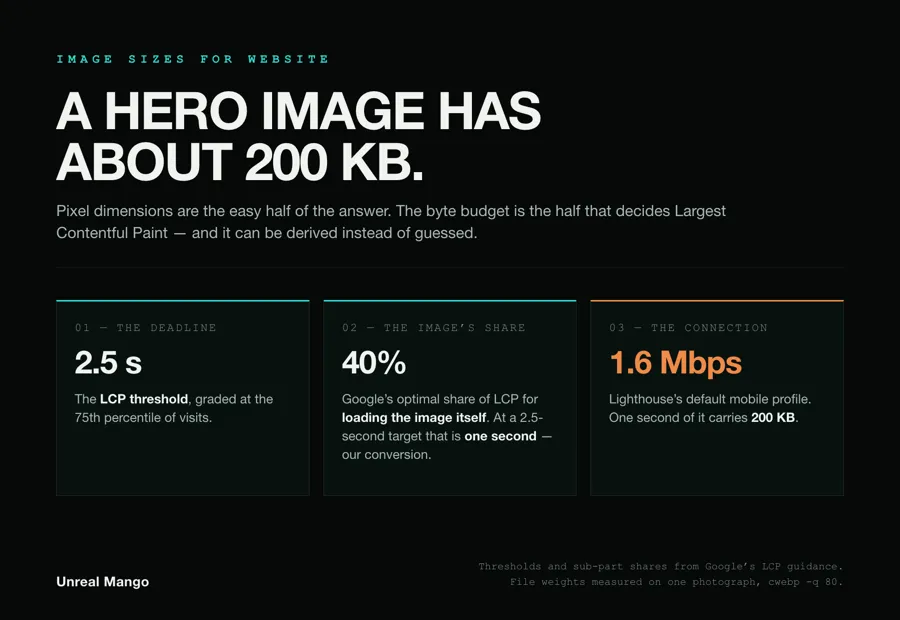
Ship a website hero at 1600 px wide, article images at 1200 px, thumbnails at 400 px, and a logo at twice its slot. Then check the number that actually decides speed: a hero has roughly 200 KB before it starts costing you Largest Contentful Paint on a mobile connection. Pixels are the easy half.
How this was checked. The 2.5-second threshold and the four-part breakdown of Largest Contentful Paint are Google’s, from the web.dev guidance on optimising LCP. The 1.6 Mbps connection is Lighthouse’s own default mobile throttling profile. Every file weight quoted below we measured ourselves on 31 August 2026, by downscaling one 3,024 × 2,016 photograph with sips and encoding each width with cwebp -q 80; the arithmetic is written out so you can redo it with your own photograph and your own audience. Kilobytes here are decimal — 1 KB is 1,000 bytes.
Image sizes for a website, element by element, with a byte ceiling on each
| Element | Typical CSS slot | Widths to ship | Ceiling for the file served | Can it be the LCP element? |
|---|---|---|---|---|
| Full-bleed hero or banner | 1040–1600 px | 800 · 1200 · 1600 · 2400 | 200 KB | Almost always yes |
| Article body figure | 640–760 px | 800 · 1200 · 1600 | 80 KB | Only if it paints first |
| Card or grid thumbnail | 300–400 px | 400 · 800 | 40 KB each | No, but it shares the pipe |
| Header logo | 120–240 px wide | Vector, or a 2× raster | 10 KB | No |
| Author photo or avatar | 40–96 px | 96 · 192 | 8 KB | No |
| Background image behind text | Viewport width | 1200 · 1600 | 120 KB | Yes — CSS backgrounds count |
Two things here are missing from every pixel cheat sheet. The right-hand columns exist at all, and the widths are plural. A single number in the “size” column is an instruction to send the same file to a 390 px phone and a 27-inch display, and that instruction is what makes image weight a performance problem rather than a design one.
One caveat on the fourth column before you quote it back at anyone: the 200 KB in the top row is arithmetic, derived in the next section. The rows underneath are our allocation of what is left once the LCP element has been paid for, not a published standard. The rest of this page is where the derivation, and the measurements behind the widths, come from.
Where the 200 KB rule comes from: 2.5 seconds, split four ways
Largest Contentful Paint is the time until the biggest thing in the viewport finishes rendering. Google’s threshold is explicit: “Sites should strive to have an LCP of 2.5 seconds or less for at least 75% of page visits.” On most marketing pages that biggest thing is an image, which means the image inherits a deadline.
The deadline is divisible. Google’s own LCP guidance splits the metric into four sub-parts and publishes the share each one should take on a well-built page:
| LCP sub-part | Optimal share |
|---|---|
| Time to first byte | ~40% |
| Resource load delay | <10% |
| Resource load duration | ~40% |
| Element render delay | <10% |
Resource load duration is the line that measures the bytes — the one your file size controls directly. Resource load delay is yours too, but it is bought with attributes rather than kilobytes, and the sections on sizes and fetchpriority below are where it gets paid for. Forty per cent of 2.5 seconds is one second of transfer time; time to first byte belongs to the server, and render delay to the paint.
One second buys a fixed number of bytes, and the number depends entirely on the connection. Lighthouse’s default mobile throttling is 1.6 Mbps down with 150 ms latency, a profile it calls Slow 4G and used to call Fast 3G, described in its own documentation as “roughly the bottom 25% of 4G connections and top 25% of 3G connections”. At 1.6 Mbps a second carries 200,000 bytes.
That is the entire derivation of the “keep it under 200 KB” advice that gets repeated without it. It is not a universal constant. It is one second of one connection.
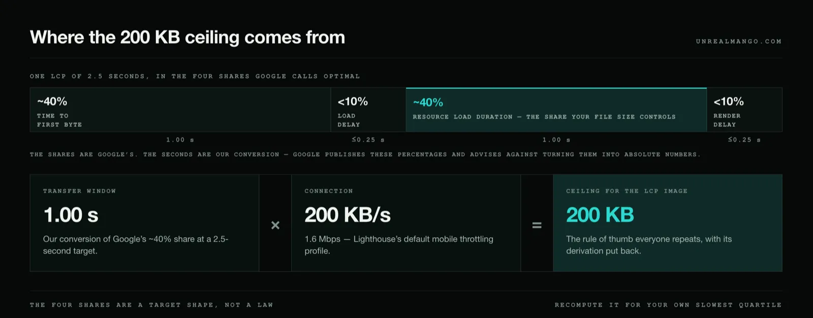
Three honest qualifiers. The 40/10/40/10 split is Google’s target shape for a healthy page, not a law of physics — a slow server eats the image’s share. The 200 KB assumes full throughput from the first byte, whereas a real connection spends its opening milliseconds on handshakes and TCP slow start.
And the third qualifier is the one we own outright: the percentages are Google’s, the seconds are ours. Google publishes those shares and then warns against exactly the step we just took. A warning callout closes that section of the guidance: “Given the 2.5 second target for LCP, it may be tempting to try to convert these percentages into absolute numbers, but that is not recommended. These subparts are only meaningful relative to each other, so it’s best to always measure them that way.” We convert anyway, deliberately, because a relative share cannot be checked against a file sitting on a disk and a kilobyte figure can. That is also precisely why 200 KB is a ceiling you should not reach rather than a target to fill.
The byte budget formula, and what it gives your audience
Recompute it for whoever actually visits you:
Budget in KB = 0.40 × (LCP target in seconds) × (throughput in Mbps) × 125
The 125 converts megabits per second into kilobytes per second. Holding the LCP target at 2.5 seconds, the budget moves like this:
| Throughput at your slowest quartile | Bytes per second | Budget for the LCP image |
|---|---|---|
| 0.4 Mbps | 50 KB/s | 50 KB |
| 1.6 Mbps (Lighthouse Slow 4G) | 200 KB/s | 200 KB |
| 3 Mbps | 375 KB/s | 375 KB |
| 5 Mbps | 625 KB/s | 625 KB |
| 10 Mbps | 1,250 KB/s | 1,250 KB |
The column heading matters more than the arithmetic. LCP is graded at the 75th percentile of visits, so the connection you budget against is the slow quarter of your traffic, not the median and certainly not your office.
Scale it to the whole page and the picture gets uncomfortable. The HTTP Archive’s 2025 Web Almanac reports that as of July 2025 the median mobile home page carried 911 KB of images inside a 2,559 KB total — both figures from its “Median home page weight by content type” chart. Those are the Almanac’s kilobytes, counted as 1,024 bytes each; in the decimal units used everywhere else on this page the images alone are about 933 KB. At 200 KB per second that is roughly 4.7 seconds of wire time before a single script runs.
What a photograph actually weighs at 400, 800, 1200, 1600, 1920 and 2400 px
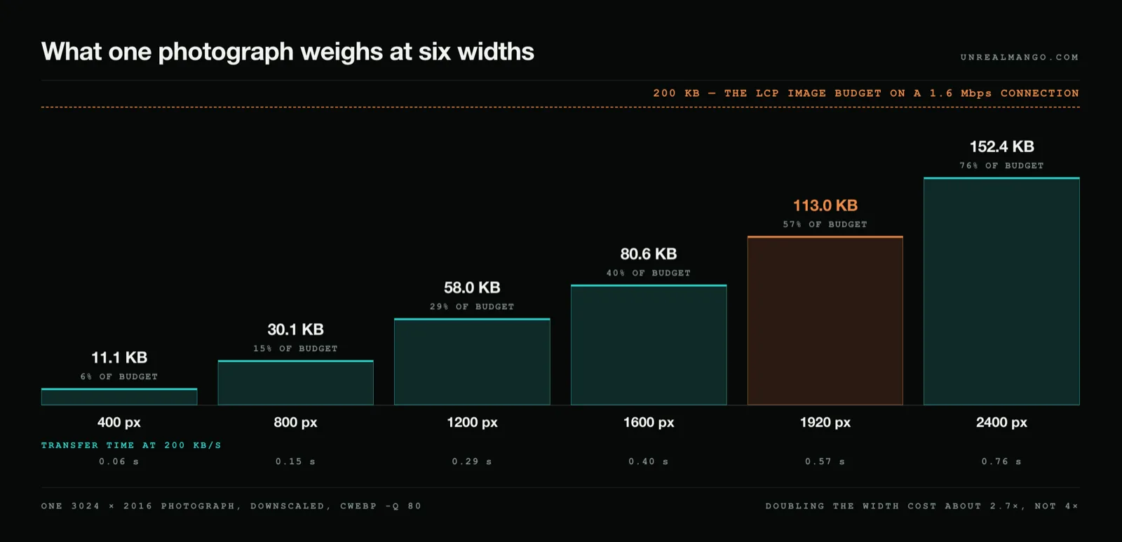
Every guide tells you to resize. Almost none says what resizing buys. We downscaled one 3,024 × 2,016 photograph to six widths and encoded each at the same quality setting:
| Width shipped | File size | Transfer at 200 KB/s | Share of a 200 KB budget |
|---|---|---|---|
| 400 px | 11.1 KB | 0.06 s | 6% |
| 800 px | 30.1 KB | 0.15 s | 15% |
| 1200 px | 58.0 KB | 0.29 s | 29% |
| 1600 px | 80.6 KB | 0.40 s | 40% |
| 1920 px | 113.0 KB | 0.57 s | 57% |
| 2400 px | 152.4 KB | 0.76 s | 76% |
Doubling the width did not quadruple the file, even though it quadruples the pixel count. On this photograph each doubling multiplied the bytes by about 2.7× — 400 to 800 px went 2.71×, 800 to 1600 px went 2.68×, 1200 to 2400 px went 2.63×. Weight grew roughly with width to the power of 1.4, somewhere between the width and the area.
That exponent is a property of the picture, not a rule. A second photograph we ran, whose original was only 1,316 px wide, jumped 5.4× between 400 and 800 px, because at 400 px it was being shrunk more than three times over and losing most of its grain. Run the ladder on your own hero before you trust any published number, including ours.
The practical reading of the table is the 1920 px row. The single file that most sites ship to everybody costs 57% of the entire LCP budget — and no phone in the world has asked for it.
srcset ships every width and lets the browser spend your budget
The argument about whether a hero should be 1200 px or 1920 px has a boring answer: neither on its own. Ship four files and let the browser pick. The mechanism has been in browsers since 2014, and it is still the part of the subject that published size guides leave out.
<img
  src="/img/hero-1600.webp"
  srcset="/img/hero-800.webp   800w,
          /img/hero-1200.webp 1200w,
          /img/hero-1600.webp 1600w,
          /img/hero-2400.webp 2400w"
  sizes="(min-width: 1100px) 1040px, 100vw"
  width="1600" height="1067"
  alt="Harvest crew loading crates at first light"
  fetchpriority="high">
Each w value is a promise about the file: a width descriptor must match the intrinsic width of the image it points at, and a wrong number silently poisons every choice the browser makes afterwards. The browser divides that descriptor by the slot width it works out from sizes to get an effective pixel density, then takes the cheapest candidate that clears the density of the screen in front of it.
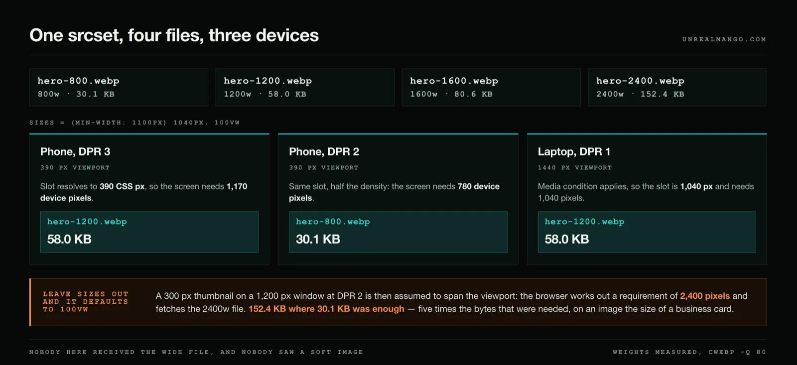
Follow one file through three devices, using the measured weights above:
- Phone, 390 px viewport, DPR 3.
sizesresolves to 100vw, so 390 CSS px, so 1,170 device pixels. The 1200w file clears it: 58 KB. - Phone, 390 px viewport, DPR 2. 780 device pixels. The 800w file clears it: 30 KB.
- Laptop, 1,440 px viewport, DPR 1. The media condition applies, so the slot is 1,040 px. The 1200w file clears it: 58 KB.
Nobody in that list received the 2400w file, and nobody saw a soft image. The wide file exists for the display that genuinely has the pixels.
sizes is the attribute that quietly breaks srcset
sizes is where responsive images go wrong, because leaving it out is not neutral. When srcset uses width descriptors and sizes is absent, it takes a default value of 100vw — the browser assumes the image spans the full viewport.
Put a thumbnail in a 300 px slot on a 1,200 px window at DPR 2 and forget sizes, and the browser computes a requirement of 2,400 pixels. Assume the thumbnail reuses the site-wide hero ladder — 800/1200/1600/2400, which is the ordinary case once one set of files is wired into a template rather than a per-component set built to the 400 · 800 in the table above. It fetches the 2400w file: 152 KB where 30 KB would have been indistinguishable. Five times the bytes that were needed, spent on an image the size of a business card. Getting sizes wrong is worse than shipping one fixed file, because it looks like you did the work.
There is a newer escape hatch, sizes="auto", which tells the browser to use the element’s laid-out width instead of your arithmetic. It is valid only in combination with loading="lazy", and that rules it out for exactly the image that matters most, because Google’s guidance on the metric is blunt: “Never lazy-load your LCP image, as that will always lead to unnecessary resource load delay, and will have a negative impact on LCP.” The same guidance recommends the opposite move for that one image — “It’s a good idea to set fetchpriority="high" on an <img> element if you think it’s likely to be your page’s LCP element.”
So: sizes written by hand on the hero, sizes="auto" and loading="lazy" on everything below the fold.
Website header size: height is a design choice, weight is not
The header is where “what size should my images be” turns into a real question, because the header’s images are first in the document and get requested before the hero they sit above.
Header height is a layout decision — 64 to 96 CSS pixels covers most sites, and nothing about performance argues for a number. The logo inside it should be small enough to be irrelevant by weight, and the exception proves the rule: at 240 CSS px wide it needs a 480 px raster on a 2× screen, and the same photograph from our ladder weighs 15.5 KB at that width — already half again over the 10 KB ceiling the table gives a header logo, which is exactly why a photograph does not belong in a header. A flat wordmark, with far less detail to encode, is a fraction of that again and clears the ceiling without effort. If the question is which logo file belongs in a header rather than what it should weigh, that is the subject of our guide to the logo lockup set.
What does cost you in a header is everything else: a background image spanning the viewport, a decorative pattern, a full-bleed photograph behind the navigation. Any of those can become the LCP element, because Largest Contentful Paint counts CSS background images, not just <img> tags. A 1600 px background at 120 KB is spending more than half the budget before your actual hero loads.
Formats change the weight of the same picture, not its dimensions
Nothing in the table above moves when you change format. A 1600 px image is 1600 px in JPEG, WebP or AVIF. What changes is the right-hand column.
Google’s own compression study — run across the Kodak set of 24 images, the Tecnick set of 100, and roughly 11,000 crawled images, at JPEG quality 50, 75 and 95 — puts WebP 25–34% below JPEG at the same structural similarity score. Google’s LCP guidance names the move directly, describing a switch to “a more optimal format (such as AVIF or WebP)” as a way to cut resource load duration. On the budgets above, a third off is the difference between a 1920 px hero fitting and not fitting.
Which container a given picture belongs in is a separate question from how wide it should be, and it is answered by what the picture is rather than by where it sits on the page — the subject of our comparison of vector versus raster images.
72 PPI does nothing on a web page, and we measured it
The “72 PPI” instruction still circulates, including inside AI-generated summaries of this very question. It is inert, in two independent ways.
First, the web’s own unit disagrees with the number. The CSS specification fixes 1in = 2.54cm = 96px, so if a web page had a resolution at all it would be 96, not 72.
Second, and more usefully, the field changes nothing measurable. We took the same 1600 px file, wrote 72 PPI into one copy and 300 PPI into another, and encoded both identically. Both came out at exactly 80,620 bytes, pixel for pixel and byte for byte. The number is a note for a printer about how large to place the image on paper. It has never controlled how a browser draws it, and it has never changed what the visitor downloads.
Two things decide how big an image looks on screen: its pixel dimensions, and the CSS box you put it in. Nothing else.
How to tell whether an image is your LCP element
Budgets only matter once you know which image they apply to, and that image is rarely the one you assume.
- Run the page through PageSpeed Insights and read the LCP element it names. Lab tools identify it directly. If it is a heading or a paragraph, your images are not your problem and this whole page is optional for you.
- If it names an image, compare rendered size to intrinsic size. Chrome DevTools prints both when you hover an image in the Elements panel. A 400 px slot filled by a 2400 px file is the classic finding.
- Weigh it against the budget for your slow quarter, not against 200 KB. Recompute with the formula above using field data from your own analytics.
- Check the two attributes that cost nothing. The LCP image must not carry
loading="lazy", and it should carryfetchpriority="high". - Re-measure in the field a month later. Lab numbers diagnose; the 75th percentile of real visits is what gets graded.
Steps one through four are also a fair description of where an image audit sits inside a broader technical SEO audit, and image weight belongs on any pre-launch checklist alongside redirects and analytics — it is far cheaper to set the ladder of widths before a site ships than to retrofit srcset across three hundred pages afterwards.
By the time that retrofit gets scoped, it is almost never a design problem: the pixel dimensions were fine, the byte budget was never written down, and one 2 MB hero was quietly deciding the score for the entire site. Building the ladder once, at the template level, is part of how we scope web design and development — because the cheapest kilobyte is the one that was never in the layout to begin with.
11 / Reader questions
Frequently asked questions
01What size should an image be for a website?
Ship a hero at 1600 px wide, article images at 1200 px, cards and thumbnails at 400 px, and a raster logo at twice its display slot. Then check the weight: on a mobile connection the image that paints first has roughly 200 KB before it starts damaging your Largest Contentful Paint.
02What is the best image size for SEO?
The best size for SEO is whichever one keeps the largest image on screen under about 200 KB, because Google measures loading speed and not pixel dimensions. No ranking system reads the width of your file. Largest Contentful Paint reads how long the file took to arrive.
03How many KB should a website image be?
About 200 KB for the image that paints first. Everything else should come in under 100 KB — roughly 80 KB for an article figure, 40 KB for a thumbnail, 10 KB for a logo — with one exception: a full-viewport background behind text, which is allowed up to 120 KB precisely because it can become the LCP element itself. That 200 KB ceiling is arithmetic, not folklore: 40% of a 2.5-second Largest Contentful Paint target is one second, and one second of Lighthouse's 1.6 Mbps mobile connection carries 200 KB.
04Do I still need a 1920 px image if most visitors are on phones?
Not that exact width, no — but you do need a wide file, and never as the only one you ship. Ship 800, 1200 and 1600 px, plus 2400 px as the wide one, because that is what a high-density display actually asks for; a phone then takes the 800 px file at 30 KB. A lone 1920 px file is the worst of both: it costs 57% of the whole LCP budget and no phone asked for it.